Cohort Grids
👤 This documentation is intended for SQL Users.
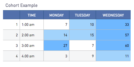
Cohort Grids are the Sisense for Cloud Data Teams equivalent of Excel Pivot Tables or Two-way Tables. One series is plotted horizontally, and another is plotted vertically. A third series of values is filled in for each cell to calculate the sum of their intersecting cells.
A Cohort Grid can have one or more parts. The Cohort column acts as the left-most vertical column of the chart. The Pivot column acts as a horizontal row across the top of the chart. Finally, the data column represents the total of values displayed in the intersecting cells.
Additional "Detail" columns can be appended to the front of the cohort grid from the "Series" tab. If the ratio of the values in the Cohort column to the values in the Detail column is one to many, only the first value within each Cohort Detail pair will be displayed.
Setting Up a Simple Cohort Grid
Cohort Grids are a great tool to mark the intersection of two or more separate series. One common example is displaying hourly data across days of the week. Shown below is a table where each row represents an hour of the day, the day, and the value at that day.
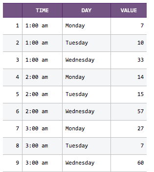
This three-column table can be converted into a Cohort Grid. The "time" column will act as the Cohort, the "day" column will act as the Pivot, and the "value" column will be the Data. To properly format the Cohort Grid, the Series tab of the Cohort Grid can bet set up using:
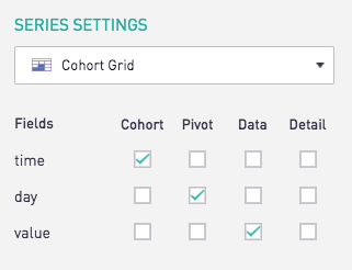
And as a result, the Cohort Chart itself now displays the summed data at the intersection of the hour and day.

Adding a Detail Column
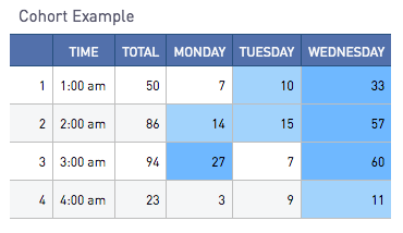
If a fourth column has been added to the original query that computes the sum of values at each hour, it can be added as a Detail column:

Nested Cohorts and Pivots
Sisense for Cloud Data Teams also supports nesting multiple cohorts and pivots to produce sums of the "Data" fields per Cohort and Pivot. To induce nesting of categories, two or more series can be selected as a cohort or pivot. Hierarchy of the nesting is determined by the ordering of fields in the SELECT statement, which is also reflected in the "Columns" ordering within the Series tab. Nesting can be performed for both Cohort and Pivot parts, with no limits to the depth of nesting.
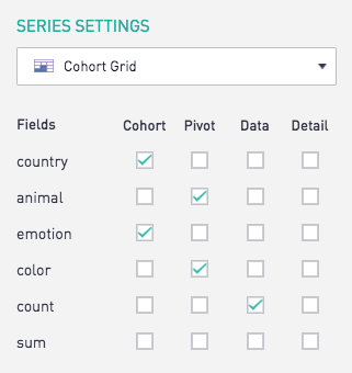
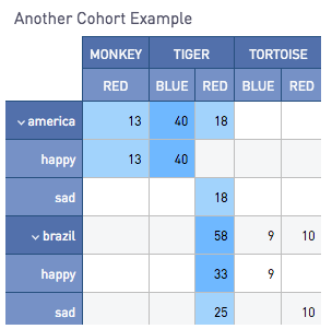
With the use of nested cohorts or pivots, each parent cohort line will display the value totaling all nested cohorts below the parent cohort.
Collapsing Nested Hierarchies
Using the arrow indications in the Cohort part of the Cohort Grid, nested hierarchies can be expanded and collapsed as needed.
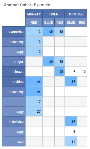
In the above example, "tiger" within the "america" parent hierarchy is collapsed, and the entire "brazil" hierarchy is collapsed.
Plotting Multiple Data Columns
More than one field of data can also be plotted for each Cohort and Pivot category. To plot an additional field of data, check another column under the "Data" section. When multiple data fields are checked, these fields will appear as additional Pivot columns within the Pivot part of the cohort grid.

Customizing Cohort Grids
In addition to Table Format Settings found in the documentation here, Cohort Grids offer additional settings as follows.

Disabling Automatic Coloring
Coloring is automatically added to the cohort cells depending on their values relative to one another. The largest third of all values are given the darkest blue, followed by the middle third with the light blue, and the bottom third with no background coloring.
This can be disabled by checking the "Disable Cohort Colors" option in the chart format tab.
Preserving Sort Order
The "Preserve Sort Order" option orders the Cohort and Pivot based on the specifications within the query. If the query output is not returning the desired sort order, refer to the community post here for a solution.
Hiding Row Totals
The "Hide Row Totals" option will disable adding row totals for nested tables.
Looking for More?
The Sisense Community contains guides on
